Simplifying Profile: A Redesign That Boosted User Engagement by 30%
Simplifying Profile: A Redesign That Boosted User Engagement by 30%
Simplifying Profile: A Redesign That Boosted User Engagement by 30%
See Solutions
About
Abulé is a virtual village that makes it easier for people to seek or fill care requests with family, friends or neighbors either in-person or online.
Abulé is a virtual village that makes it easier for people to seek or fill care requests with family, friends or neighbors either in-person or online.
Impact
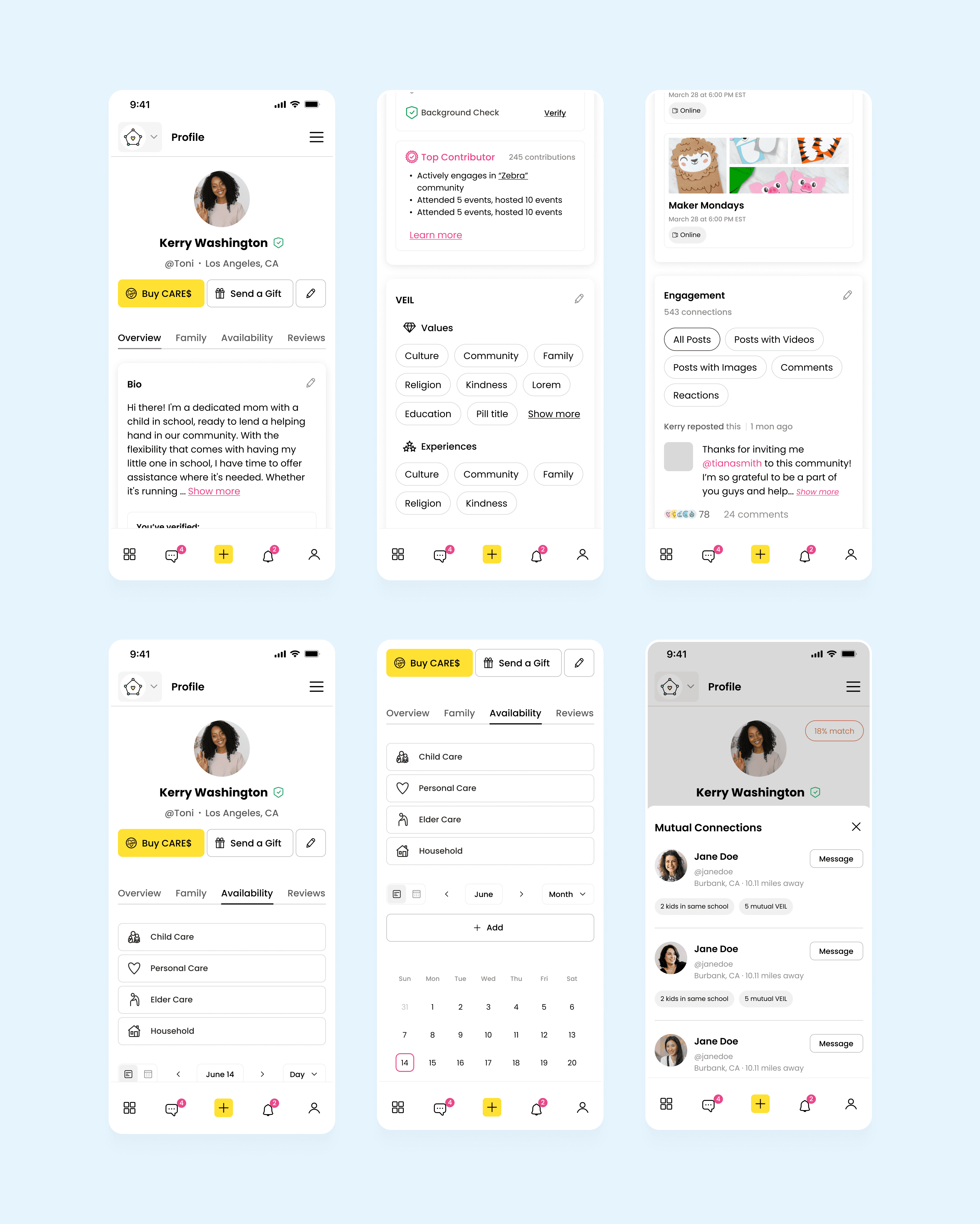
I redesigned 4 tabs of the profile page for the main and other users, improved the structure, visual, and created new user flows
I redesigned 4 tabs of the profile page for the main and other users, improved the structure, visual, and created new user flows
Team

Product Manager
Product Manager
Toyosi
Toyosi

UX/UI Designer
UX/UI Designer
Toni
Toni

Lead Developer
Lead Developer
Fisayo
Fisayo
My Role
Visual redesign
Information Architecture
User Flows creation
Prototyping
Timeline
June 2024 - September 2024
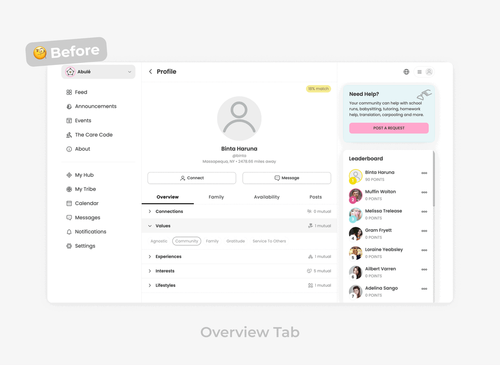
Problem
The profile pages for primary and secondary users were outdated and inconsistent, missing key information. Usability testing showed that 60% of users struggled to find essential details, and engagement rates were 40% lower compared to other sections. Four key profile tabs needed redesigning to improve structure, visuals, and functionality, increasing efficiency and user satisfaction.
The profile pages for primary and secondary users were outdated and inconsistent, missing key information. Usability testing showed that 60% of users struggled to find essential details, and engagement rates were 40% lower compared to other sections. Four key profile tabs needed redesigning to improve structure, visuals, and functionality, increasing efficiency and user satisfaction.
The profile pages for primary and secondary users were outdated and inconsistent, missing key information. Usability testing showed that 60% of users struggled to find essential details, and engagement rates were 40% lower compared to other sections. Four key profile tabs needed redesigning to improve structure, visuals, and functionality, increasing efficiency and user satisfaction.
How we did that?
How we did that?
Let’s start a story, shall we?! 👇
Let’s start a story, shall we?! 👇
Chapter 1
Where is my Bio?
Where is my Bio?
After the kickoff meeting, I explored the new design system and older versions of pages. Then I started by redesigning the profile overview tab. I gave the visuals a refresh, and during the design critique, an insight popped into my head...
After the kickoff meeting, I explored the new design system and older versions of pages. Then I started by redesigning the profile overview tab. I gave the visuals a refresh, and during the design critique, an insight popped into my head...
🫢
Where is a Bio that we are asking during the onboarding?
Where is a Bio that we are asking during the onboarding?
After that, we also realized that there were other things that needed to be redesigned.
After that, we also realized that there were other things that needed to be redesigned.
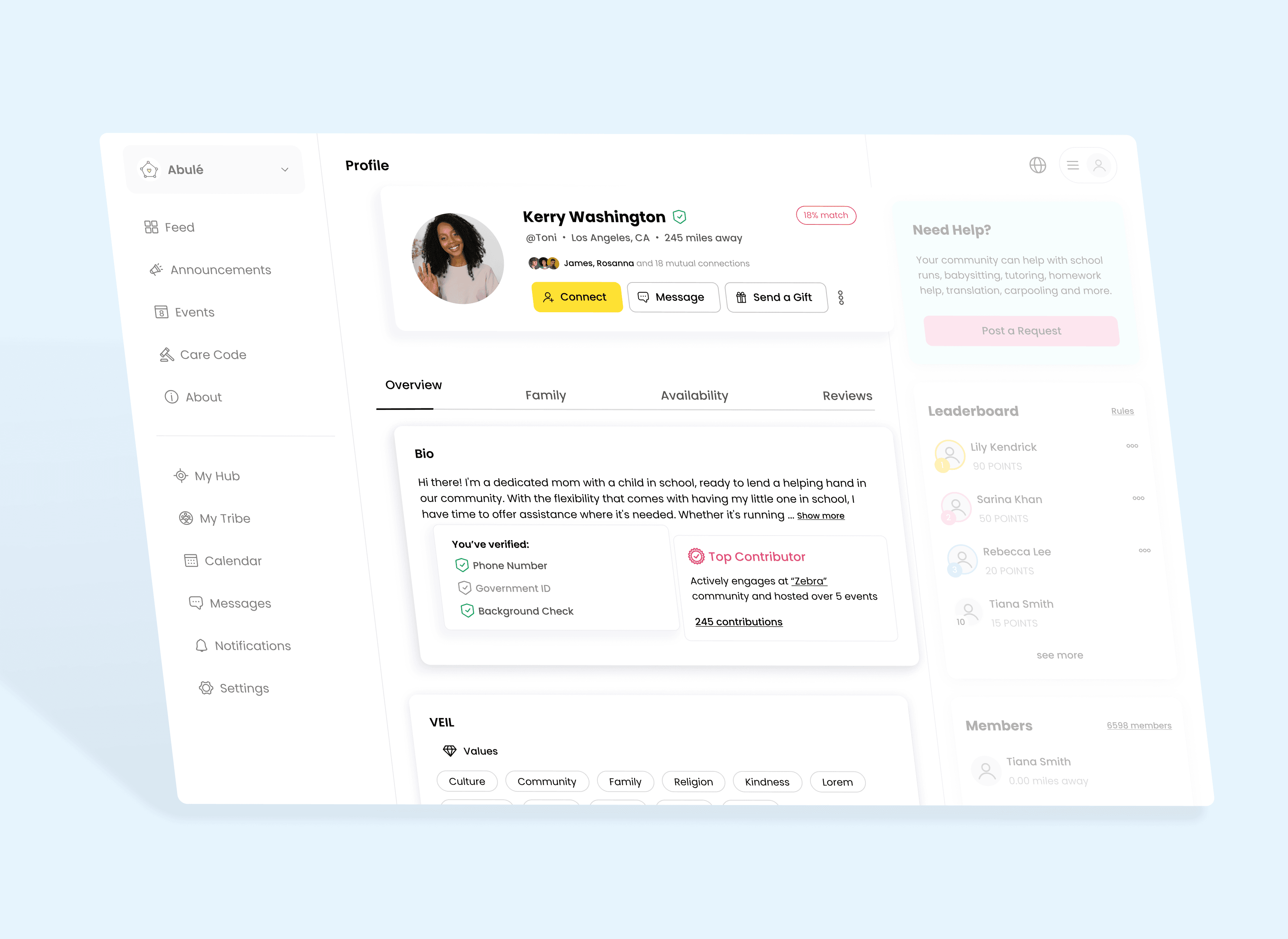
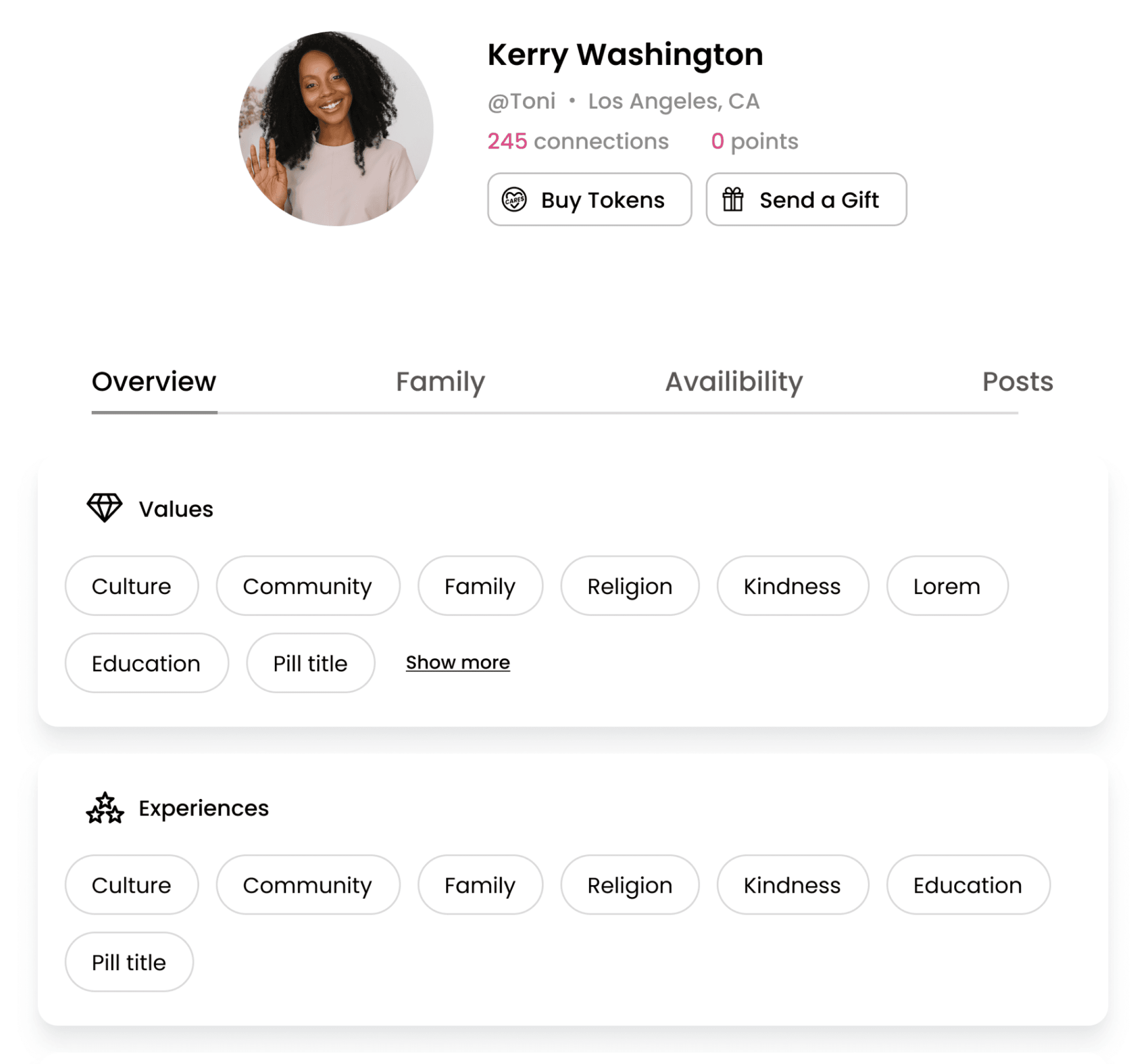
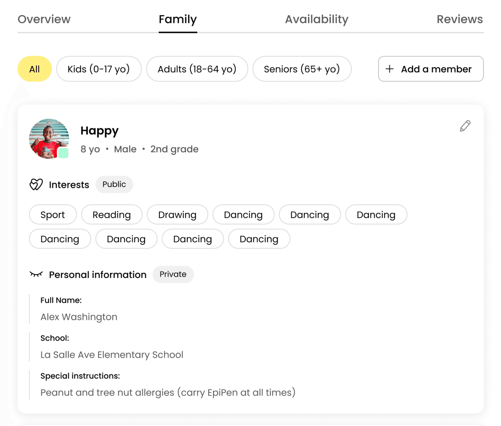
So here is the final “Overview Tab”
So here is the final “Overview Tab”
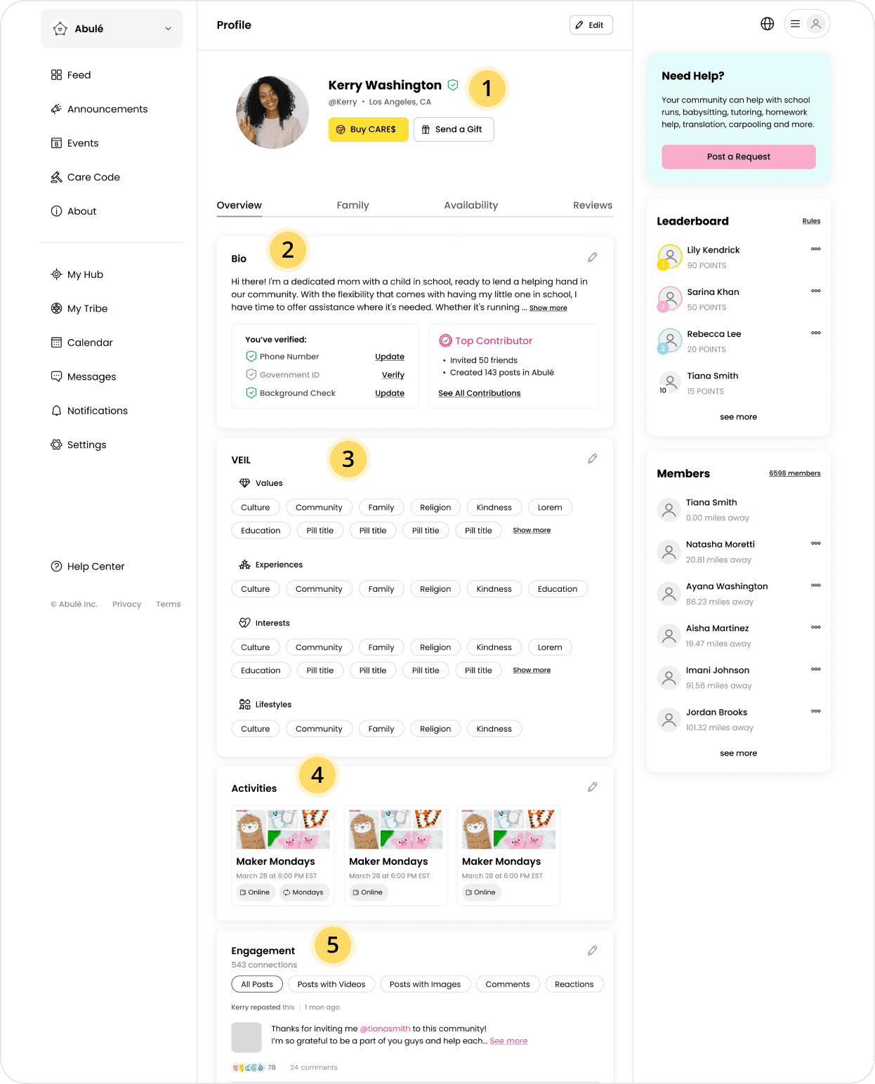
1
We've made the layout left-centered, added a verification badge, and reconsidered what the call-to-action (CTA) should be
We've made the layout left-centered, added a verification badge, and reconsidered what the call-to-action (CTA) should be
2
The updated design includes the bio, verifications, and member’s contributions
The updated design includes the bio, verifications, and member’s contributions
3
Now VEIL is grouped in one card and it's just a part of the overview tab
Now VEIL is grouped in one card and it's just a part of the overview tab
4
Also we added “Activities” which is a coming feature on the platform
Also we added “Activities” which is a coming feature on the platform
5
And last but not least, the "Reviews" tab has replaced the "Posts" tab, so now you can see all engagement here
And last but not least, the "Reviews" tab has replaced the "Posts" tab, so now you can see all engagement here
Chapter 2
Complexity
Complexity
When I started working on the “Availability” tab I realized that it’s more complex than I thought.
After diving deeper into the logic behind this feature I was like...
When I started working on the “Availability” tab I realized that it’s more complex than I thought.
After diving deeper into the logic behind this feature I was like...
🤯
It’s overwhelming.
But how can we simplify that?!
It’s overwhelming.
But how can we simplify that?!

Old version of the “Availability” tab
“I need to brainstorm”
“I need to brainstorm”
And sketching helped me to realize...
And sketching helped me to realize...
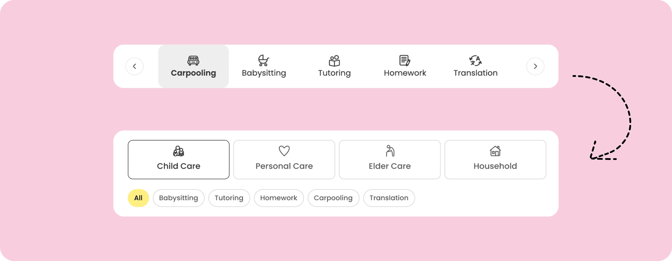
First thing that makes you feel overwhelmed is unorganization of categories. It’s just a list of services that supposted to help you filter availiability but feels messy.
First thing that makes you feel overwhelmed is unorganization of categories. It’s just a list of services that supposted to help you filter availiability but feels messy.
So let’s reconsider our categories first!
So let’s reconsider our categories first!
🤨
“Okay, that’s better! But show us a full design”
“Okay, that’s better! But show us a full design”
As well as reconsidering categories, we also added two types of views (list and calendar) and created components for time slots
As well as reconsidering categories, we also added two types of views (list and calendar) and created components for time slots

Filtrating Availiability time slots

Calendar View
And that’s not all
And that’s not all
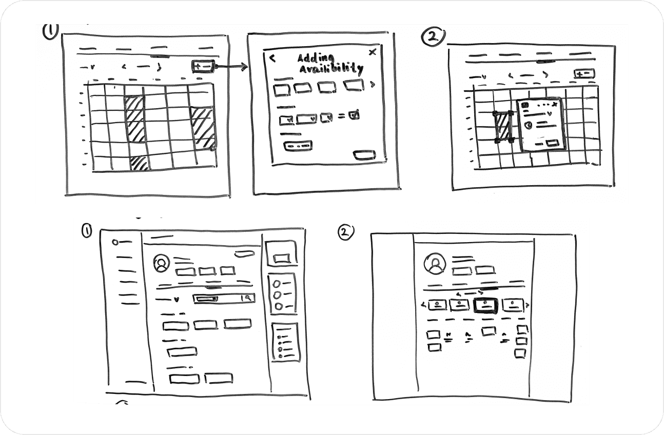
We have created user flows for adding availability for each service, taking into account specific details.
We have created user flows for adding availability for each service, taking into account specific details.

Adding Availiability slot
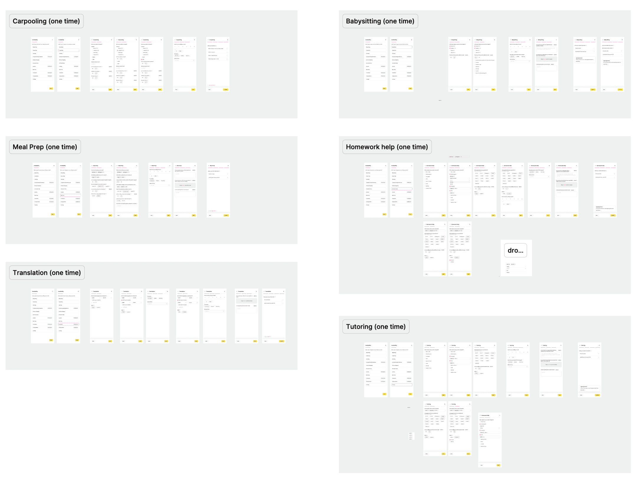
Forms for different services
Chapter 3
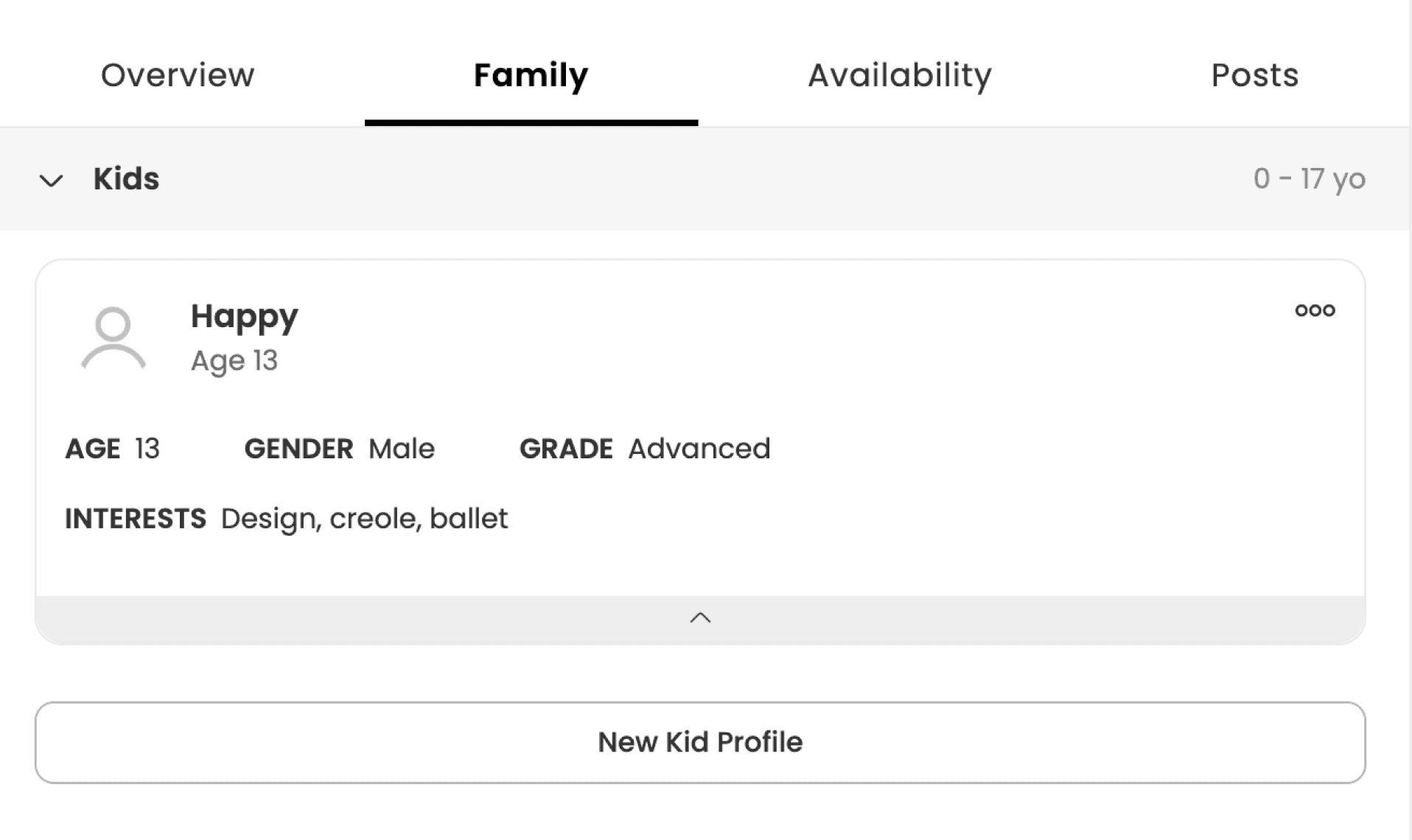
Please, add a family member
Please, add a family member
After working on the redesign of the "Availability" tab, redesigning the "Family" tab seemed like an easy task. When I explored the old version, my first thought was...
After working on the redesign of the "Availability" tab, redesigning the "Family" tab seemed like an easy task. When I explored the old version, my first thought was...
😅
It needs to be simplified and organized as well
It needs to be simplified and organized as well
Before
After
Chapter 4
Designing from scratch
Designing from scratch
🧐
“I won’t trust someone with no reviews”
“I won’t trust someone with no reviews”
The last tab we redesigned for the Profile page is "Reviews." Considering the context of the platform, users need to trust each other to allow someone to pick up their kid from school, prepare meals for the whole family or help with cleaning
The last tab we redesigned for the Profile page is "Reviews." Considering the context of the platform, users need to trust each other to allow someone to pick up their kid from school, prepare meals for the whole family or help with cleaning
So how they can trust each other more
So how they can trust each other more
Having a reviews page is such an obvious solution, and it's really helpful.
Having a reviews page is such an obvious solution, and it's really helpful.

Reviews Tab
Chapter 5
How I see other members profiles
How I see other members profiles
How I see other members profiles
All the designed screens you saw above were for the main user view. It obviously has more functionality, such as "Edit," "Add," and "Show/Hide" buttons, etc.
All the designed screens you saw above were for the main user view. It obviously has more functionality, such as "Edit," "Add," and "Show/Hide" buttons, etc.
🤓
“Okay, we want to see other member's view”
“Okay, we want to see other member's view”

Overview Tab for other member's view
Chapter 6
Mobile Version
Mobile Version
Chapter 7
Design Impact
Design Impact
Design System Improvements
🗂️
🗂️
Enhanced the design system by recreating more editable components such as side panels, pills, buttons, icons, etc. as well as moving to variables
Enhanced the design system by recreating more editable components such as side panels, pills, buttons, icons, etc. as well as moving to variables
Testing on Mobile
📱
📱
Conducted additional testing on mobile devices that gave some insights
Conducted additional testing on mobile devices that gave some insights
Handoff Process
🙌
🙌
Improved the handoff process and collaboration with developers, leading to increased team productivity
Improved the handoff process and collaboration with developers, leading to increased team productivity
File Organization
👩💻
👩💻
Organized files and established working guidelines based on developer feedback
Organized files and established working guidelines based on developer feedback
Chapter 8
My Learnings
My Learnings
Collaboration
🤝
🤝
Collaborate and ask for feedback at different stages of the design process. This can prevent spending time on irrelevant tasks
Collaborate and ask for feedback at different stages of the design process. This can prevent spending time on irrelevant tasks
Research Competitors
🔍
🔍
Research references and learn from competitors' best practices and mistakes
Research references and learn from competitors' best practices and mistakes
Testing Hypotheses
👩🔬
👩🔬
Test hypotheses on stakeholders as well and document their feedback
Test hypotheses on stakeholders as well and document their feedback
Improving
📚
📚
Keep learning and incorporate more AI into the process to improve productivity
Keep learning and incorporate more AI into the process to improve productivity
Next Case Study 🙌
Next Case Study 🙌
Next Case Study 🙌
Crafting Personalized Workout Plans to Boost Fitness and Wellbeing by 10x
Crafting Personalized Workout Plans to Boost Fitness and Wellbeing by 10x
Web platform that employs AI to create personalized workout plans and revolutionize fitness routines
Web Platform
UX
Visual Design
Open to interesting challenges and opportunities 🧩

Say Hi!
valeriia.ux@gmail.com
© 2025 Made with love and Framer by Valeriia Prymachenko
Open to interesting challenges and opportunities 🧩
Say Hi!
valeriia.ux@gmail.com
© 2025 Made with love and Framer by Valeriia Prymachenko
Open to interesting challenges and opportunities 🧩
Say Hi!
valeriia.ux@gmail.com
© 2025 Made with love and Framer by Valeriia Prymachenko